Note
Go to the end to download the full example code.
Provided Axes – Mixing with Other Plots
Combine a life graph with a regular matplotlib chart on one figure.
import matplotlib.pyplot as plt
from datetime import date
from lifegraph import Lifegraph
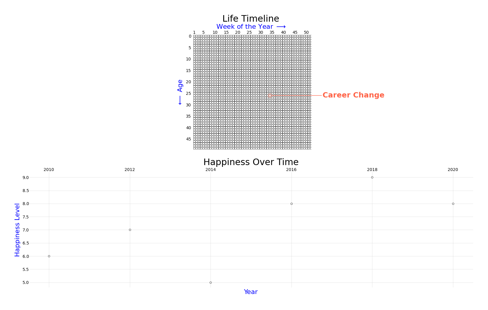
fig = plt.figure(figsize=(16, 10))
ax1 = fig.add_subplot(2, 1, 1)
g = Lifegraph(date(1988, 5, 10), max_age=50, ax=ax1)
g.add_life_event("Career Change", date(2015, 1, 1), color="#FF6347")
g.add_title("Life Timeline")
g.draw()
ax2 = fig.add_subplot(2, 1, 2)
years = [2010, 2012, 2014, 2016, 2018, 2020]
happiness = [6, 7, 5, 8, 9, 8]
ax2.plot(years, happiness, marker="o", linewidth=2, color="#4169E1")
ax2.set_xlabel("Year")
ax2.set_ylabel("Happiness Level")
ax2.set_title("Happiness Over Time")
ax2.grid(True, alpha=0.3)
plt.tight_layout()
fig.savefig("provided_axes_mixed.png", dpi=300, bbox_inches="tight")
Total running time of the script: (0 minutes 0.867 seconds)